

Discover Financial rewards – lead designer (14 years)
Acted as Design Lead for Discover Financial Rewards team, managed team of designers for 5% Cashback Bonus Rewards campaign, overseeing 300+ creative assets annually, including UX/UI for mobile app, landing pages, emails, animations, social and more. Delivering solutions for complex needs via design best practices to ensure all work adhered to brand and inspired end-user interaction, successfully contributing 30% increase in sales in 2019. Work embodies a strong passion for aesthetics with business experience and strategic thinking resulting in creative solutions supported by user research, learnings, and solid design principles.
UX Case Study:
Rewards Mobile App
problem diagnosis
The Discover Financial Service’s cardmembers had no way to track their Cashback Bonus Rewards in the mobile app experience, as this function only existed on the website. User Research uncovered that customers wanted a quick visual to show accumulated rewards, easy sign up and redemption history.
MY ROLE
My role as Design Lead at Discover Financial Services was to design a seamless journey for customers including: Rewards Log In page, Rewards Sign Up page, Recent Activity page, Refer a Friend page, and Redemption History mobile app pages. Collaborated with researchers, stakeholders, eCommerce team to create user flows, wireframes, Rewards icon, quarterly sign up carousel, UI design with accessibility testing, pie chart tracker, prototype, and tested with eCommerce team.
RESULTS
Discover Carmembers now can sign up for rewards, track their 5% and 1% Cashback Bonus, redeem rewards on their app, view redemption history, and refer a friend to Discover. The Sign Up screen allows the cardmember to redeem their Cashback Bonus, easily sign up for next quarter categories, view the tracker, refer a friend to Discover, or view redemption history. The Rewards redemption screen gives the customer four ways to redeem their rewards: cash, pay credit card with Discover balance, gift card, or charity.
Discover financial services persona
Amy is a 42 year old housewife from Columbus, Ohio. She is married with two children. She is a middle school teacher with a B.S. degree and an annual income of $65,000. Both she and her husband both work full time to make ends meet. Her favorite brands are Amazon, Target, Costco, Kohls, CVS and Apple. Her financial goals are to pay off debt, add to emergency fund, and save for her children’s college education. She uses Discover Rewards to pay toward her monthly credit card statement, saving her family money.

UX CaSE STUDY:
Discover Financial credit card Application
problem diagnosis
Discover Financial Service’s credit card application time was 30 days from the time the customer began the application process until their application was approved. Research results showed document uploading and progress tracking were the main pain points for users. The application process required 15 steps to complete and more complicated that our competitors’ applications.
MY ROLE
My role as Design Lead at Discover was to research competitors application processes, collaborate with DevOps to create user flows, low-fidelity sketches, information architecture, wireframes, and prototypes for web, iOS, and Android. The goal was to reduce the application approval time down to three days. Created progress bar, missing document drop downs, modal upload box, live chat, call function, and application tracker.
RESULTS
Reduced application approval process time from 30 days down to 3 days. Reduced steps that cardmembers needed to complete to submit a credit card application from 15 down to 5 steps. Discover’s application process now rivaled competitors’ application processes and helped grow our customer base.
rewards Instagram video
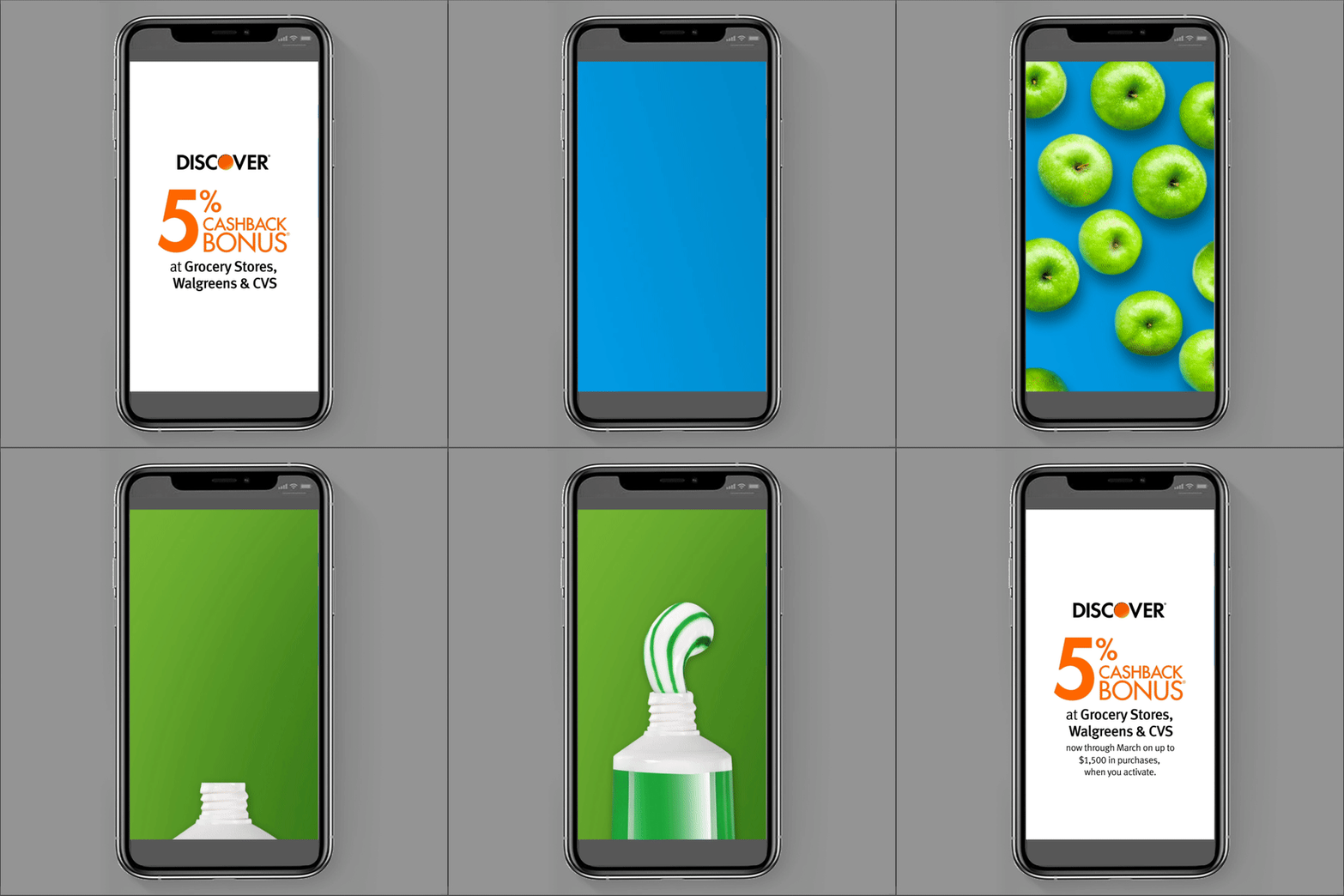
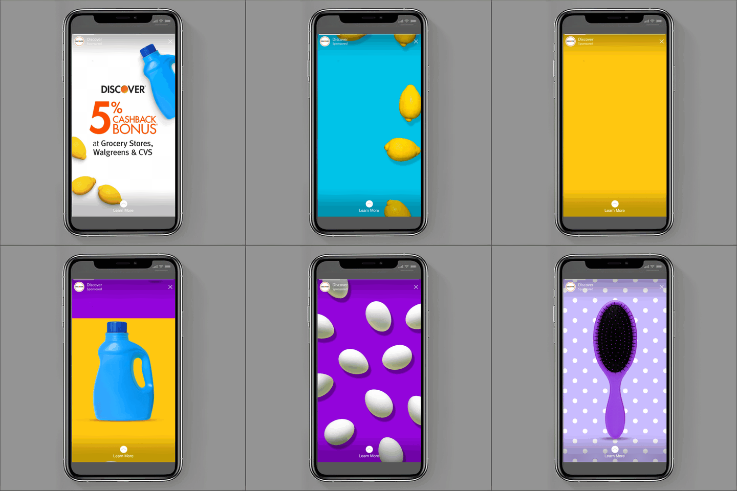
Designed and animated social media placements for Discover Financial Services Rewards campaigns on Facebook, Instagram, Pinterest; achieved 84% increase in click-through rates on Facebook and over 500K Instagram views for 1 video.
Fully integrated campaigns
Managed team of designers for 5% Cashback Bonus Rewards campaign, overseeing 300+ creative assets annually, successfully contributing 30% increase in sales, encompassing landing pages, mobile apps, credit cards, animated emails, display banners, video storyboards, kiosks, and social media posts.






Northern trust
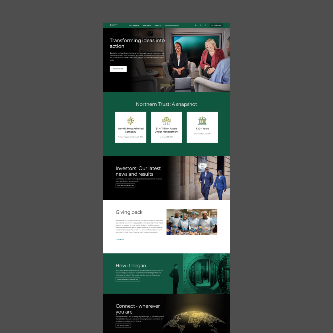
Conceptualized and executed high-fidelity design solutions aligned with Northern Trust’s strategic goals across Wealth Management, Human Resources, and Asset Servicing initiatives, from inception to completion. Analyzed and visualized statistical data to assess the efficiency of marketing campaigns and provided actionable insights for optimization, across web, video, social, ads, and print. Enabled 18% year-over-year surge in traffic sessions on Northerntrust.com by orchestrating development of user-friendly interfaces for over 30 responsive web projects.
UX Case Study:
A-Suite Landing Page Wireframe
Problem Diagnosis
A-Suite was a new feature on the Northern Trust website and is a community that brings the latest insights, research, and networking opportunities for asset owners to learn and collaborate. A UX wireframe was needed for the A-Suite homepage landing page and UI visual design was needed to define the A-Suite brand. This was a new page and the placement on the site needed to be determined in the information architecture and UX/UI requirements needed to be identified.
My Role
Attended initial kickoff with Stakeholder, Design Manager and Engineering after reading the creative brief, determined that the Insights & Research navigation tab was the best location for this page in the Northern Trust architecture. Collaborated with engineering to determine which Design System modules were available on this section of the site, as this varied throughout the site. Collaborated with design team to determine hierarchy of sections: Header module, Video module, Featured Content module, Insights Articles module, Leadership module, and CTA module. Provided three wireframe options with alt module styles and prototype, suggested interactivity of image zoom on hover function, conducted user research with sample group to ensure a seemless user experience, used WCAG to test accessibility, sliced images and met with engineering to handoff. I also designed visual branding for A-Suite including: logo, landing page header, photo style, typography, video play bar, and icon style.
Results
Current iteration of A-Suite landing page was chosen and tested at mobile, tablet, and desktop breakpoints. The A-Suite Network has been a very successful with over 1,800 global asset owner clients, across corporations, not-for-profits, public funds, insurance companies, central banks and sovereign wealth funds.




UX Case Study:
Northern Trust Video Play Bar
Problem Diagnosis
A video play bar needed to be designed for the A-Suite web pages that would work with available back end functionality.
My Role
Provided several solutions including play functions by subheads for audio only play function and play bar integrated into the bottom of the video (shown). Collaborated with engineering to determine which function limitations existed. Designed progress bar, play/pause, audio slider control, second counter, share, closed caption, and full screen functions into play bar.
Results
Several iterations were designed and tested until this final video play bar design was proven to work consistently across all browsers.
M1 Finance
Developed and implemented B2B and B2C brand identity for FinTech marketing campaigns across mobile app, web, video, email, app store, ad campaigns, and social platforms. Executed fully integrated UX/UI campaigns contributing to total AUM increase from $6B to $9B over 18 months. Contributed to $18M increase in AUM on Retirement Rollover Promo campaign with enhanced user experience including sitemap process flows, wireframes, storyboards, UI mockups and prototypes, animations and user testing.


UX CASE STUDY:
M1 Finance Mega menu
problem diagnosis
M1 Finance needed an updated navigation menu bar with dropdown functionality, intro subheads, primary, secondary and tertiary navigation. The current navigation bar was a simple rectangle and looked outdated.
MY ROLE
My role was to research the existing M1 menu pain points with user group. Questions I asked the group were: What are you trying to achieve with the M1 app?, What are the biggest challenges you face when using the M1 app?, How easy was it to navigate to the How M1 Pies work page?, Which pages are the most important to you? I learned from research that the Cash Account Spend navigation was the most popular followed by the Investment product and IRAs. I provided several design options with a more contemporary look and feel and with the hierarchy updated to reflect the needs of the customers.
RESULTS
The final approved M1.com mega menu design incorporated a sticky header with margin padding to allow parallax scroll functionality behind the menu and included M1 logo, Log in link, Get Started CTA, intro subhead, primary, secondary, and tertiary menu links, turning complex navigation into an intuitive user experience.
M1 Finance persona
Taylor Made is a 53 year old man from New York, NY. He is married with two children. He is an entrepreneur with a Masters degree and an annual income of $360,000. His favorite brands are Porsche, Cartier, Cole Hans, Ritz-Carlton. His financial goals are to double his savings through investing and attain financial freedom so he has more time to spend with his wife and children. The M1 Finance App is a great DIY investment tool that makes sophisticated wealth building simple by using his extensive knowledge of finance.
UX CASE STUDY:
M1 Finance Homepage
problem diagnosis
M1 Finance needed an updated Homepage UX Design. The current homepage did not showcase the top products offered, had a small video portal, and need to emphasize account protections to ensure that M1 is a trusted brand. Several UX Designers were asked to provide updated wireframes, typography, color schemes, keeping the existing mega menu design.
MY ROLE
I joined a UX Design group to come up with a homepage solution. I provided the wireframes and the other team members provided typography and color scheme recommendations. My wireframe included a bold header section with M1’s tagline headline, scrolling info bar with number of users and app store ratings, four cards to represent “Earn, Invest, Spend, and Borrow” product lines, full width video, carousel showcasing top app features, and account protections with icons. We had a department design presentation with several groups presenting their ideas.
RESULTS
My wireframe was adopted and combined with a visual design from another team, including: mobile app visual, wavy line visual, color palette and typography style sheet for H1, H2, H3, H4, and fully rounded button style.
WAVICLE DATA solutions
Spearheaded B2B marketing strategies focus on demand generation for rapidly growing AI tech companies in Chicago. Revamped company brand identity, including tone, identity, typography, color palette, and photo treatment, to be aligned across all marketing campaigns. Achieved 35% increase in website traffic sessions by optimizing responsive, mobile-first user experience.


United airlines
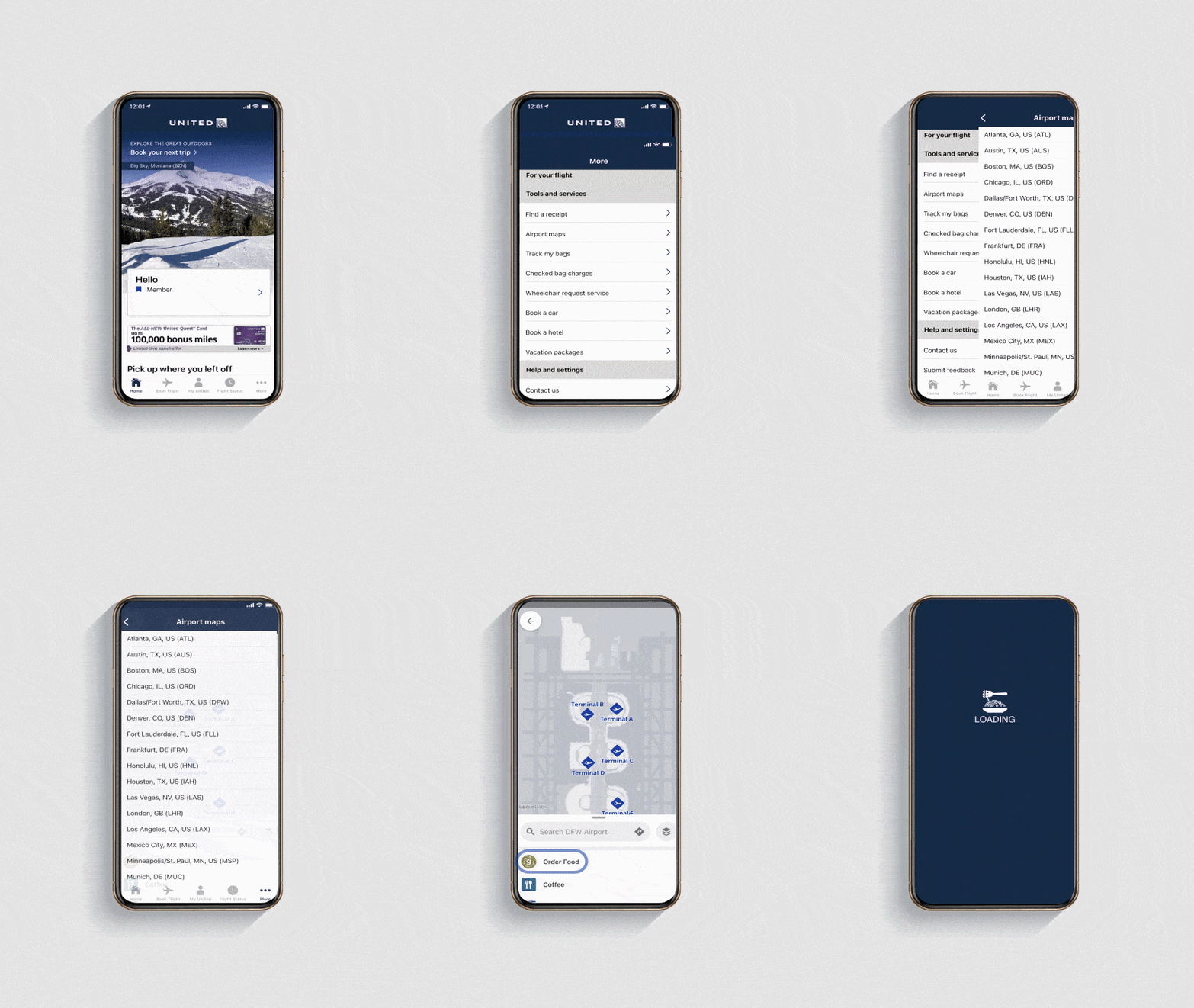
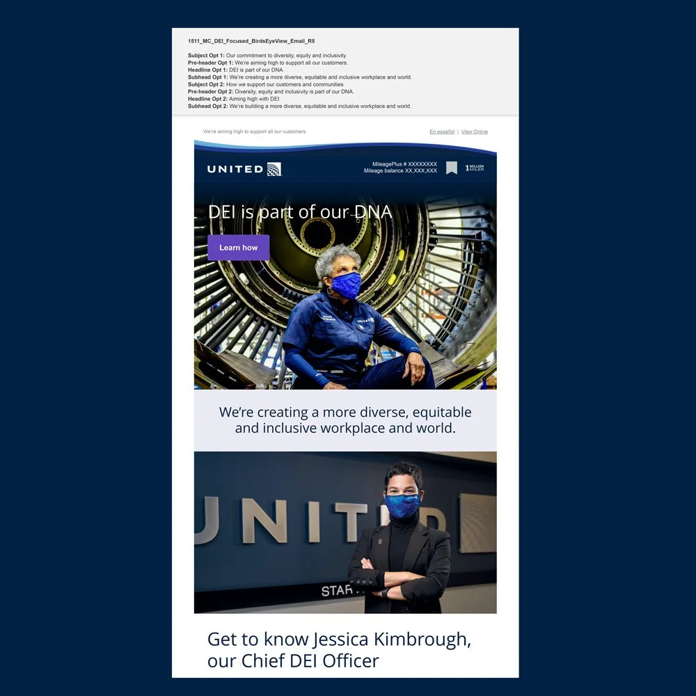
Collaborated with brand, editorial, UX, social media, and business teams to ensure compelling and emotional customer experience. Developed and implemented branded identity and strategies for integrated marketing campaigns across digital, print, collateral, product packaging, environmental graphics, and web platforms. Spearheaded fully integrated UX/UI campaigns for initiatives such as Diversity and Inclusion, Ticket Validity, and Ordering Food at Gate mobile application.




Abbott
LABORATORIES
Devised concepts for Depakote, Gabitril and Neurontin pharmaceutical campaigns including intranet sites, kiosks, sales aids, magazine ads, brochures, calendars, emails, web banners, display booths, increased Depakote ER sales by 20%.


